The experience that users have when they visit your website plays a pivotal role in what happens during and after their visit. It just makes sense. Sites that are easy to navigate and pleasant to use are more likely to get you the results that you want.
If you are going to make any investment in the internet marketing of your business, improved user experience can get you the best return. User experience, typically written as UX, encompasses every aspect of what your site visitor experiences when they engage with your website. It starts with clicking your ad or your listing in search results, and continues through any actions that your user takes on your site.
Improved UX has a wealth of benefits, including:
- Lower bounce rates.
- Higher conversion rates.
- Increased customer loyalty.
- Higher revenue.
Whether your website visitor wants to find your phone number to call your office, locate directions, read about your company services or make an appointment online, your website design should make those actions easy to complete.
How to Improve Your Website's UX
A few design changes can significantly improve your site's UX. Each of these changes will make it easier for your visitors to navigate your pages, get the information they're looking for and complete the actions they wish to take at every stage.
1. Have a Clear Call to Action (CTA) on Every Page
Every page on your site should serve a purpose. What do you want visitors to do when they land on that page? Making sure that each page has a clear and concise call to action can help nudge them in the direction you want.
A good CTA is informative. It tells your visitors why they should take action. It includes a strong command verb, making it clear what you want them to do. It is clear and compelling, making them understand what they stand to gain.
As an example, if you're a dentist consider the CTA for your page on dental cleanings: "When was your last cleaning? Click now to make an appointment" is a CTA that provokes users with a question, then leads them to the next step.

2. Choose a Color Palette and Stick to It
Sometimes, a site's design gets out of your control. You'll add pages and wind up changing color palettes or themes as the site grows. This leads to a situation where the site does not have a cohesive look and feel, which can distract from your user's experience. Make sure that you stick with the color palette you have chosen at the beginning.
In most cases, choosing three colors that are evenly spaced around the color wheel is a good way to start. These combinations tend to be easier on the eyes and lend a cohesive look and feel to your site.
Consider Your Fonts, Too
Just as you need consistent color choices, you need consistency in your font, as well. Pick ones that are easy to read. Size and space them appropriately. A good rule of thumb is no more than three font choices.
There's been a lot of digital ink spilled about whether serifs or san serif fonts are better. It turns out that the differences between the two are minimal. Choosing the right combinations is more important. Using serif and san serif together can increase readability and develop a stronger sense of communication and character.
Spacing is also of vital importance. In studies, volunteers who read poorly designed pages had a negative experience and absorbed less information while those reading well-designed pages have better user experience.
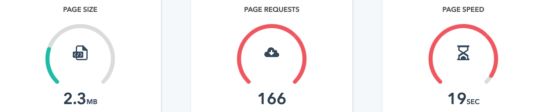
3. Nobody Likes a Slow Website
Every second your visitor spends waiting for site elements to load brings an increased risk that they'll close the tab and go to your competitors instead. Make sure that everything on your website is built for sleek and elegant speed.
Take out or fix any design elements that are slowing your site down. These can include large images, videos and external scripts.
To ensure that images are not loading slowly, consider using WebP Optimized Images. These are built into HubSpot CMS, so they are simple to use.
Tools you can use to test your website speed include:
4. Build for Mobile
Mobile users account for about half of all web traffic. Make sure that these visitors are having the same high quality experience as any others. To optimize for mobile, make sure that the following is part of your design:
- Fast-loading images.
- Short, easy to read paragraphs.
- Lots of headers and subheads for easy skimming.
- Buttons, if needed, at both the top and bottom of the page.
Having a site that is easy to navigate from mobile means capturing more users. A potential client, or one who hasn't been in to your practice in a while, can visit your site to research a dental issue or make an appointment from wherever they are. Allowing people to do what they need to from their phones means that you are capturing people when your practice is top of mind, making it far more likely that they'll go ahead and make the appointment.
5. Keep Navigation Clear and Concise
When designing a site's navigation, the needs of your user should come first. Don't think about SEO until you have created a website that allows visitors to quickly and easily find everything that they want.
If visitors are having to hunt for what they want, they'll quickly get frustrated and go to your competitor instead. Remove everything that is superfluous so that they can get to the meat of your website easily. Make navigation simple with navigation bars located at the top or side of the page so they can get what the want with a click.
Once you've accomplished these top-level navigation goals, think about other needs your visitors will have. Often, potential patients have questions about dental problems or procedures. Linking from your procedure page to a blog post about a dental condition can help your patient learn more and make a decision about the care that they need.
6. Simplify Your Messaging
It's like we say, clarity is king. If users have to drag themselves through endless blocks of text, you're going to lose them. Make every piece of your messaging slim and simple.
Avoid using technical jargon or clichés. Neither communicate anything that is valuable to your user. Keep your sentences short. Anything longer than 25 words is usually going on too long. Break compound sentences in half to see if they read better.
Stick with shorter paragraphs. Most should be three to five sentences, tops. Short paragraphs are easier to digest and leave white space that is easier on the eyes.
7. Stay Away from Stock Photos
We're all told that sites need images in order to draw attention. But, not any images will do. You need the right visual information to make an impact.
Stock images can look generic and inauthentic. Because anyone can buy the same photos you can, there's a good chance that your main image will show up somewhere else. Trust is a vital part of your relationship with your customers. If they find inauthentic photos when they visit your site, this can subtly affect your relationship in negative ways.
Additionally, people tend to skip over images that are not relevant. A stock image doesn't tell anyone anything valuable about your business, so it winds up being wasted space.
What should you do instead? Take photos that show your unique value preposition. Create images of your team at work. Use photos of your founders in place of stock shots of happy people. The improvement can be dramatic. A photo of the business's founder, in one instance, increased conversions 35% over a stock photo.
By using actual photos from your practice, you can use those images to create a connection. Your current and potential patients will feel more relaxed and at home than they would with a generic photo of people or graphics that have nothing to do with you.
8. Build on the Right CMS
Your content management system (CMS) is the strong and stable structure that supports your digital presence on the web. Choosing the right one can have a huge impact on your user experience.
Choose a CMS that offers the features that you want without loading your site with ones that do not add value. WordPress is known to have plugins that can bog down your site. Many do little to enhance user experience. While your visitors are waiting for these elements to load, they're getting impatient and ready to go visit someone else instead.
We recommend and are proud to work with the HubSpot CMS. The HubSpot CMS is designed to put user experience first. It's fast, so elements load without trying your visitors' patience. It has a modern look for eye appeal. It is safe, to protect your visitors and your business. And, it's built with mobile in mind, so you don't have to worry whether your visitors who come to your website by phone or tablet can find the things that they need.
9. Find the Right Resources to Monitor and Improve Your UX
It's not enough to make changes. You need to track your results to see what works. Putting the right resources to work can give you a clearer picture of your UX and the best ways to improve it. With good analytics, you can test design elements against one another to see which one your site visitors are more likely to respond to. Over time, by improving user experience one element at a time, you can create top UX for higher conversions and a better return on your marketing investment.
Hotjar website analytics and engagement software can give you data that includes heatmaps, screen recordings visitor polls and other assets. The software can be easily integrated into HubSpot CMS with a line of code. Then, you can start learning more about your visitors and what they want from sites like yours.
How Do You Stack Up?
Curious how your website performs against other practices? Learning what you are doing well and where you can use some improvement can help you rank better in the search engine results and experience better conversions once users are on your site.
Helping you to have all the information you need to excel in your field is what we do at The Diamond Group.
About The Diamond Group
The Diamond Group is a Wilmington, NC based digital marketing and web design agency committed to helping today's small businesses grow and prosper. With a 30-year track record of success, their proprietary in-house system and concierge-level multi-disciplinary team approach to marketing guarantees double-digital growth and optimizes marketing ROI.
Related Posts